The Corsair Gaming K70 RGB RAPIDFIRE Mechanical Keyboard Review
by E. Fylladitakis on July 1, 2016 8:00 AM EST- Posted in
- Peripherals
- Corsair
- Keyboard
- Cherry MX
- Mechanical Keyboards
- RGB

As with every market that goes through a sustained period of significant growth, the market of mechanical keyboards is becoming heavily saturated. There already are dozens of companies offering literally hundreds of mechanical keyboards, covering nearly all shapes and sizes in the process. Designers try to innovate and differentiate, which lead to features such as RGB lighting and modular key switches, but this becomes exceedingly difficult as the number of companies and products continue to increase, especially since there's only a small number of mechanical key switch designs to build keyboards around.
Therefore, several companies are now trying to innovate on the design of the mechanical key switches themselves, and we are starting to see new switch designs coming into production in 2016. The first few new designs came from Chinese/Taiwanese manufacturers, but the high demand has meant that the older and larger players would not stay idle either.
One of the first and largest players in the mechanical keyboards market is Corsair. They slowly entered the market with just a single keyboard, but it was such a great success for the company that they soon founded Corsair Gaming, a sister company focused on marketing and selling gaming-related peripherals. Corsair’s great success is heavily attributed to their exclusive deals with Cherry, the most reputable manufacturer of mechanical key switches. For example, they had an exclusive for Cherry MX RGB switches for a year, which made the K70 RGB one of the most popular top-tier gaming keyboards last year.
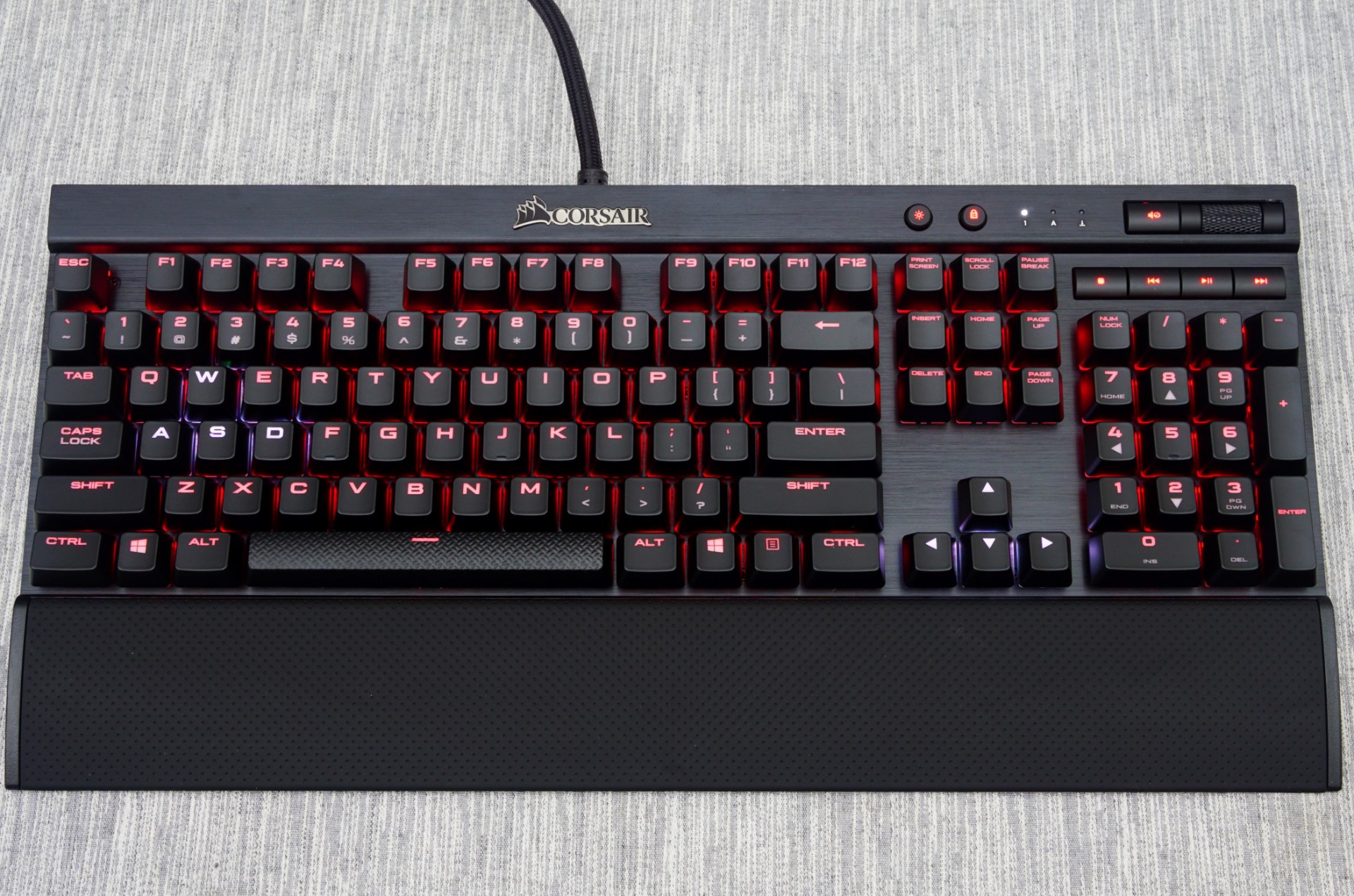
Today we are having a look at the K70 RGB RAPIDFIRE, the keyboard born from another exclusive deal that Corsair has made with Cherry’s new mechanical key switch, the “RAPIDFIRE”. It is a switch designed specifically for gaming by combining light actuation force and higher actuation speed. On paper it does sound interesting, and today we'll put its design to the test to see if there's any actual improvement over Cherry’s “classic” designs.
Packaging and Bundle
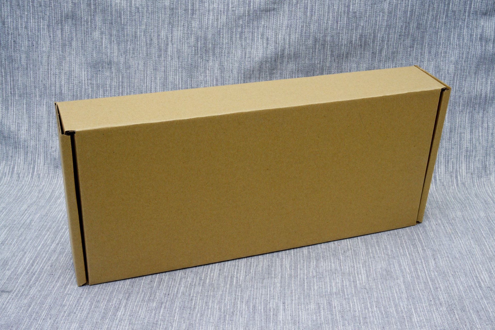
We received an early production sample of the keyboard so Corsair did not have its exterior packaging ready yet. It will most certainly be dark with yellow accents, aesthetically focused on a picture of the keyboard itself, like every other keyboard packaging they produce since 2014. The cardboard packaging is very strong and offers more than sufficient protection to the keyboard during transport.
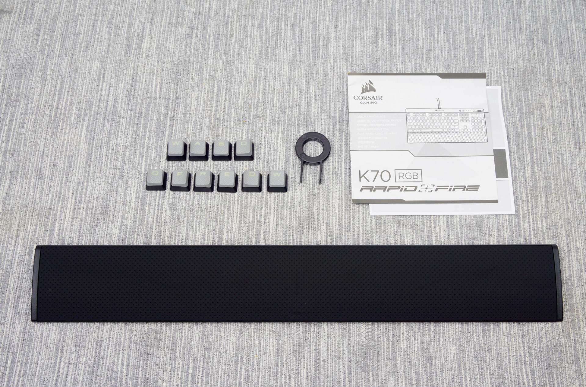
Inside the box, we found a couple of basic quick-start and warranty leaflets, a set of extra keycaps and a full size wrist rest. The wrist rest has a corona-treated surface that gives it a soft, comfortable rubber-like feeling. The extra ten keycaps have contoured, textured top surfaces, assisting tactile feedback when gaming. The first set is supposed to be for FPS gamers and the second for MOBA gamers. Both sets are contoured and textured. Two keycaps, the W and the D, exist in both sets but have different contours as a result.


36 Comments
View All Comments
Rhosta - Sunday, July 3, 2016 - link
The font is made this way from practical reasons. Keyboards with Cherry MX switches have very bad quality of backlight (surprisingly wasnt mentioned in review). The light is bleeding all over the place a very little light is actualy reaching the key itself, so keys are backlit pretty badly and colors are pale. This big font is put there to simply help with this issue, so letters catch more light and colors are thus more easily recognizable.ddriver - Sunday, July 3, 2016 - link
Big and Ugly are two different things. The font can be big without being ugly. Much like it can be ugly without being big.Rhosta - Sunday, July 3, 2016 - link
If you can, show us some better solutions, because I don't think there are many left.Those keys are backlit mainly in its upper half, so you want to fill this part of space, which results in what we see here - big, wide and bold font.
Felix_Ram - Monday, August 8, 2016 - link
Here's an idea, how about you keep your little bag of angry shi-te to yourself and not ruin my day.BurntMyBacon - Tuesday, July 5, 2016 - link
@inighthawki: "I'd have to side with ddriver on this one."Why side with anyone. It's a matter of preference and opinion.
Speaking of opinion, I collected several more to illustrate a point:
I think the spacing is too small for my preference. The the font is also obviously stretched, but this aspect bugs me perhaps a little less than ddriver. It's not my preference, but it also isn't the worst I've seen out of a big name brand.
My granfather really likes it. Large letters and backlighting are pluses. He would like the secondary functions to also be back lit.
My eldest sister really likes it. Again, large letters and backlighting.
My youngest sister thinks its alright. Large letters are nice. Doesn't really care for backlighting. Spacing is a little cramped, but not too bad.
My dad doesn't really care.
My nephew loves the font. Best looking font he's seen on a keyboard.
I would suppose that as people get older and their eyesight weakens, this type of aesthetic is quite suitable. Of course gamers (the target audience) tend to be a bit younger than my grandfather, but perhaps the younger generation finds the stretched look aesthetically pleasing. Point is, aesthetics are a largely opinionated subject and everyone is entitled to one. I personally don't place a lot of value on aesthetics as long as they don't hinder the practical functionality of the device. All else equal (or nearly so), however, and I'll go for the better looking option.
III-V - Friday, July 1, 2016 - link
Do you think everything that isn't Helvetica is "ugly?"Fun fact -- what is visually appealing to people is quite subjective.
theduckofdeath - Monday, July 4, 2016 - link
Exactly, III-V.The complaint that this looks like a gamer keyboard is a bit silly considering it is primarily sold as a gamer keyboard. Corsair focuses quite strongly towards that demographic. I mean, it's literally in its name. Though, I think Corsair is keeping the gamer look at an acceptable moderate level compared to a lot of other brands.
Personally I think it looks okay. The only reason I didn't get this specific keyboard when I bought a new one last year was because I wanted a more compact design, so I got the CM Quickfire TK.
Lolimaster - Saturday, July 2, 2016 - link
There is a reason this is yet another RGB keyboard :POmega215D - Sunday, July 3, 2016 - link
To me the Romer G keys feel better than cherry mx browns even with O-rings. It's alsoncalled buying, trying and if it doesn't suit my needs it goes back. I also only buy keyboards when they are on sale (which thankfully Best Buy seems to be doing lately). My last mechanical keyboard is the CM Storm trigger but it needs a new PCB and since my parents need a new keyboard I'd figure I'd fix it up and get a new toy.zeeBomb - Friday, July 1, 2016 - link
Whats a good mechanical keyboard under $80 CAD?