The Logitech Harmony Elite Experience: Ultimate Control
by Brett Howse on February 14, 2017 8:00 AM EST- Posted in
- Accessories
- Logitech
- Remote Control
- IoT
- Smart Home
- Harmony
The Logitech Harmony Elite Remote
Before we dig into the software side, let’s first look at the part of the Harmony Elite system you will more than likely use the most, and that is the remote itself. Logitech has meandered over the years in terms of remote design, and they have been putting screens onto remotes for over a decade already, but the Elite is the best design they have ever come up with.
Touchscreens are something we now use every day, but that doesn’t mean they are always the best use case for a given situation. The biggest downside to a touchscreen is that it forces users to interact with it by first looking at it. That might sound obvious, but it’s one of the biggest detractors from a touchscreen as well. Forcing someone to look at a screen can make a simple task into a complex one, at best. At worst, they can be outright dangerous in some scenarios like in a car, where many manufacturers have forgotten that sometimes it’s important to be able to turn on the defrost without going through five menus first. The car scenario is perhaps a stretch when discussing something like a remote control, but the same principles are in effect. Touch requires the user to divert their attention, focus on a screen, ensure the screen is showing the correct options, and then touch it in the right location, where there is little to no feedback that the correct option was touched.
 The Harmony Ultimate One
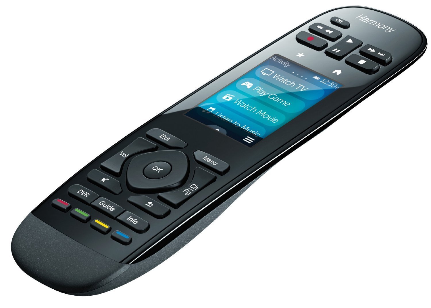
Logitech has made some poor choices over the years with Harmony remotes, to the ultimate (pun intended) mistake of the Harmony Ultimate. This remote featured a touchscreen in the very center of the remote, between the volume and navigation buttons, and the transport buttons. It was an insane decision. Luckily, Logitech has seen the error of their ways, and they’ve now situated the touchscreen at the top of the remote, where it is less likely to be accidentally pressed.
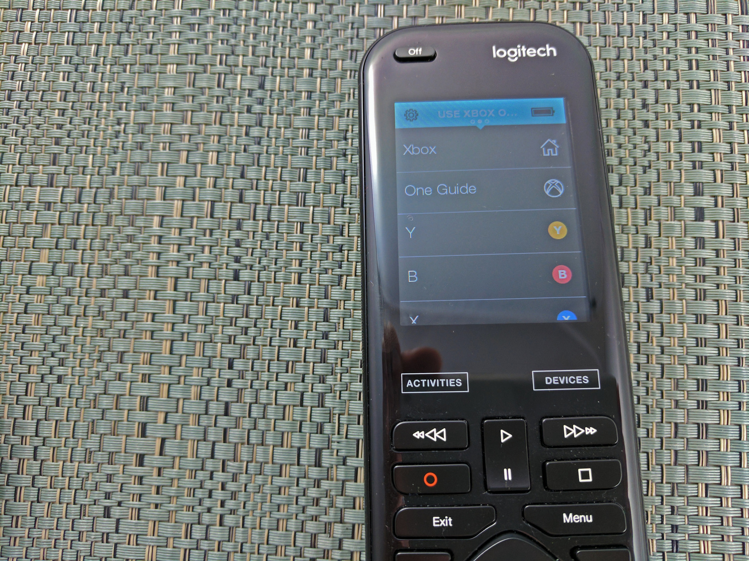
Let’s talk about the screen itself. It’s a 1.5-inch diagonal display with a whopping resolution of 128x128. It can display 65,000 different colors. Considering the use model for the display, it’s adequate, but that is the best thing you can say about it. A sharper screen would go a long way to make the Elite look a bit more premium, especially for the price. The colors are washed out, and the text is pixelated, but at the end of the day, it does function well. For most interactions, the screen is mostly used to choose activities, and to use less-used buttons, so the touchscreen works well in this scenario, since you end up using it less. On a remote control, one of the keys is not needing to look at it, after all. Still, a better display would be one way Logitech could step up their game.
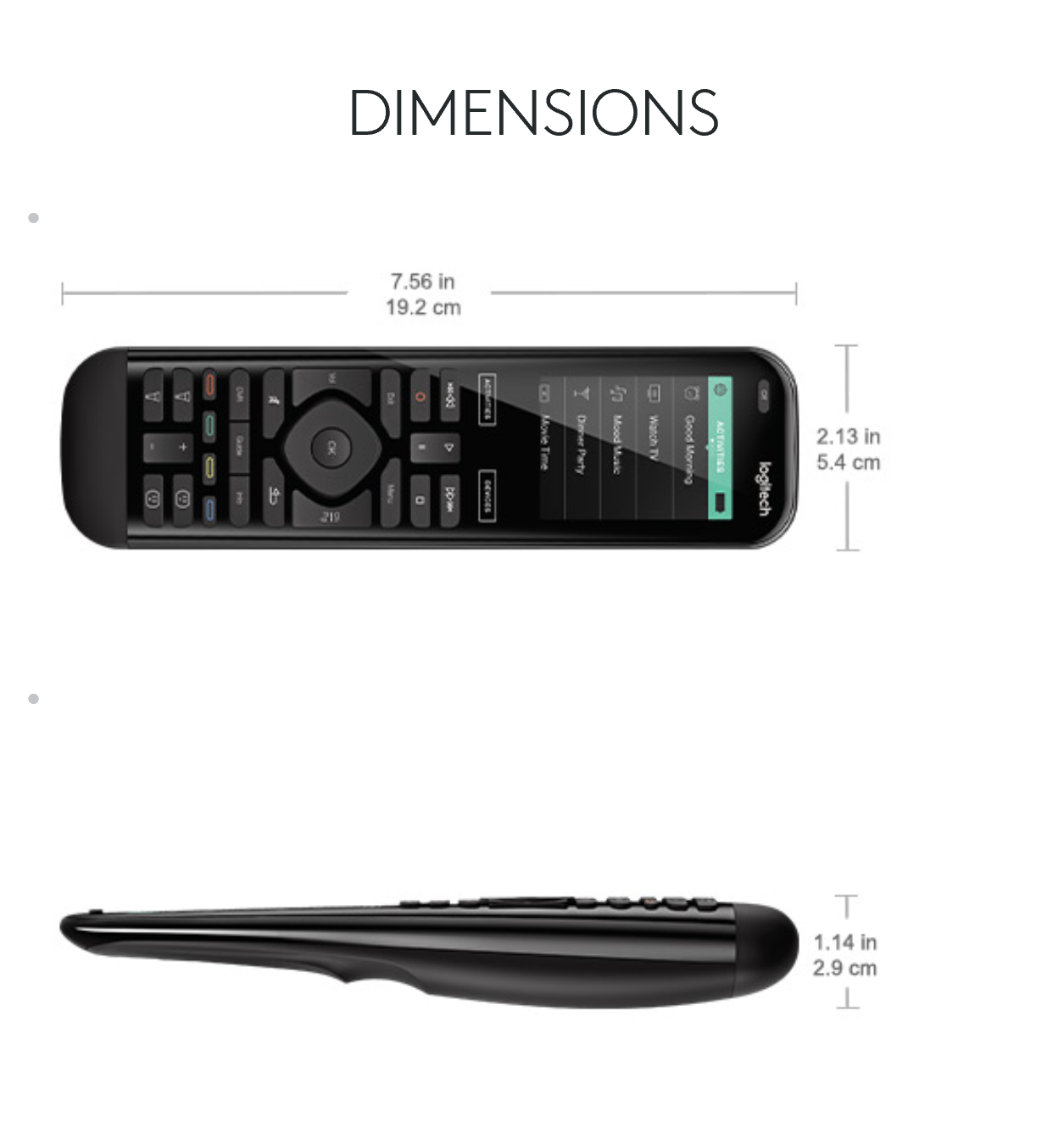
The remote itself is very well designed. The top is a smooth, glossy, black plastic that is pleasing to look at, while the underside is a coarse texture that prevents the remote from slipping out of your hand. It measures 54 mm wide, by 29 mm deep, by 192 mm high (2.13 x 1.14 x 7.56 inches) and unboxing the remote, the short height was one of the first things I noticed. It is significantly shorter than the Harmony One it was replacing. It also weighs 164 grams (5.8 oz) which makes it feel solid, but doesn’t give you any sort of fatigue in use, and most of the weight is near the bottom, meaning it is easier to hold in your hand.
The smaller remote was achieved by removing many of the buttons off the remote, which might sound like a disaster, but in fact, it was very well thought out. The number pad was moved to the touch screen, which is likely the only casualty that will really be noticed, but those were buttons that I never used often so I don’t miss them at all. Other buttons were removed, such as skip, and those could be an issue, except that the Elite allows all buttons to offer two controls. Press is one, and press and hold for a second is another, so skip and fast forward now share the same button (unless you change it of course, since you can). By default, fast forward was press, and skip was press and hold, but in my home that is the opposite of how I would use it, so I swapped them around.

In fact, the removal of buttons has made the remote somewhat easier to use. As an example, delete on my DVR was a button beside the zero on the number pad. With the Elite, it is programmed to be a long press on Stop, which is much easier to access.
Regardless, shrinking the remote has made it more comfortable to use, and much easier to access all the buttons that are there. It really was a smart move. The new buttons are also just the right amount of click, and are an improvement over the Harmony One this model is replacing for me. In over ten years, I’ve never had a Harmony button stop working, and the remotes have been replaced for other reasons, so hopefully that continues to be the case with the Elite.
The remote feels solid, is comfortable to hold, and the layout is much easier to use. After a few generations of Harmony mucking up their remote layout, they seem to have made just the right course corrections with the Elite.


99 Comments
View All Comments
gilmoreisu - Tuesday, February 14, 2017 - link
Good review, agree with what you have her. I'd definitely recommend, but understand it is pricey. Overall it is a great remote. I had the 880 for years and really loved most of it.Pros: Too many to list, but here are a few
- Once setup, even my wife and kids can use it
- The help button auto-fixes most issues, teach it to the kids and wife
- Ergonomics are great, probably the best I've used
- It controls anything with Bluetooth, AndroidTV, PS3/4, Nintendo Wii/U (cons are sometimes it doesn't connect)
Cons:
- Price, you should never pay more than $250, sometimes Best Buy runs a trade in deal and you can find for $200
- As stated, battery, it stinks, and if you have kids that never put it on the cradle, good luck
- Activities and Devices button should have been physical, just no reason for capacitive
- The touchscreen causes too many mishaps, if you pick up the remote wrong, you may accidentally open another action, kids especially (happens 1 to 2 times per week)
- No number buttons - but you get used to it
- Harmony Software not as intuitive as I'd like (how do I reorder the activities screen? How do I add buttons on the touch screen?)
Azethoth - Wednesday, February 15, 2017 - link
For my money Activities and Devices should be ABOVE the touch screen. The goddamn touch screen should need a click on them to activate. The rate of bad accidental clicks on it is insane.I reprogrammed the red circle and white square buttons to be skip back and skip ahead. These require single press or auto repeat. The default programming for them is useless. Long press for record.
The button layout is awful. Exit Menu DVR Guide Info need to be together. They are spread out and not possible to use by touch alone. There needs to be big gaps between various blocks of buttons like the color ones and especially the most frequently used navigation ones.
Buttons you will constantly click by accident:
Anything on the fucking touch screen.
The satan damned Activities and Devices buttons.
Exit and Menu
Mute / DVR / Red
Swap / Info
The touch screen error rate is so bad i made the remote wake up on press only. This means backlight is not on when raising it which sucks donkey balls but compared to the fucking touch screen bullshit is acceptable.
There is so much good with the hub (I never get activity errors anymore), and the iPad and iPhone app is a joy to work with. Its sad that they fucked up the button layout so badly.
A simple tap and hold mode for the touch screen would be a giant improvement. No response ever to a single click.
smartthanyou - Tuesday, February 14, 2017 - link
No number keys makes this garbage, pure and simple.weevilone - Tuesday, February 14, 2017 - link
I haven't really needed them. Anytime there's a source that I might want to change channels, the favorites list is on the LCD so I can just click a channel I like. If I'd like to select a different channel directly, I swipe the favorites off the screen and that's replaced by a numeric keypad on the LCD. It's not tactile, but I probably use it twice a year.weevilone - Tuesday, February 14, 2017 - link
It would suck if you had to constantly enter a passcode for parental control, or something like that.Fallen Kell - Wednesday, February 15, 2017 - link
Exactly. This has been my issue with all touch sensitive LCD screen remotes since they first came out. Too many of these remotes are putting everything on the LCD when in fact hard buttons are still an absolute necessity. The point of a remote is to control items quickly and easily. You should not be forced to need to look at the remote in order to operate it for standard functions (i.e. number pad for changing channels, volume up/down, channel up/down, last/return, menu, info, exit, and a 4 way direction pad+select/ok button, fast forward/rewind/stop/play/pause/record/next chapter/previous chapter at a minimum, additional important buttons like power off and mute, and a scroll up/down). Without those buttons, you need to look at the remote for controlling most items, but with them, you can happily control almost all standard features of TV/entertainment systems while never missing the action.Azethoth - Wednesday, February 15, 2017 - link
maybe your usage pattern is different. I have everything i watch recorded and i never watch live. I can then always skip ads. Favorite buttons navigate faster than messing with the number buttons.I have never used the numpad on this remote. it would actually be nice if i can disable it completely.
Azethoth - Wednesday, February 15, 2017 - link
I programmed the favorite buttons to replace the number buttons. for me that means a few of the single and double digit channels, syfy amc bbc etc. and one each for the beginning of HBO, Showtime, Stars, Cinemax. Now you can pop up the guide and instantly go to any of these and scroll to adjacent channels. Works better than the number thing for me on DirecTV.Edgeman - Tuesday, February 14, 2017 - link
I had one and sent it back. It is good for relatively simple systems and ordinary equipment but for a whole house system with matrix switches and multiple audio and video sources and displays, it is just not even close to up to the task, it is way too dumbed down to get it to work with everything, much less good macros. Instead, I bought four Phillips Prontos (sadly no longer made) on eBay. They are infinitely programmable via the PC software.andychow - Tuesday, February 14, 2017 - link
You could just buy a cellphone that includes a IR blaster.