In-Depth with the Windows 8 Consumer Preview
by Andrew Cunningham, Ryan Smith, Kristian Vättö & Jarred Walton on March 9, 2012 10:30 AM EST- Posted in
- Microsoft
- Operating Systems
- Windows
- Windows 8
The Desktop
If you refuse to believe that Metro can bring you anything but pain and sorrow, the good news is that the Windows desktop is still here, and it’s just as powerful and full-featured as it was in Windows 7. In fact, except for the absence of the Start button, it’s largely identical to the desktop in Windows 7—Metro is obviously where Microsoft has spent most of its development effort this cycle, but the Windows 7 desktop is still good enough that it’s not a big deal. You already know how this works if you’re a Windows user, but there have been a few useful enhancements and tweaks to give heavy desktop users some reason to upgrade.
Windows Explorer

A Windows 7 window (top) compared to a Windows 8 window (bottom). Note the very slightly narrower horizontal window borders in Windows 8.
The first thing you'll notice is that the window borders have changed slightly from those in Windows 7—corners are now squared-off, rather than rounded, and the font size in windows title bars is quite a bit larger. Window borders have also been put on a diet, though a very modest one—a Windows 8 window will use about four pixels less horizontal space than a Windows 7 window providing the same information.
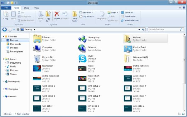
The next thing you'll likely notice is that Windows Explorer has picked up the Ribbon interface first introduced in Office 2007. You’ve probably already seen and formed an opinion about the Ribbon (it also found its way into some Windows 7 applications like Paint and Wordpad, and was refined for Office 2010)—it was introduced in Office to replace the arcane maze of traditional menus and expose hidden functionality that people weren’t using because it was hard to find. In the context of a feature-rich program like Office, I think it does just what it was designed to do. In a less feature-packed program like Paint, I think it’s unnecessary but inoffensive. In Windows Explorer, it falls somewhere in between.

The Explorer ribbon is minimized by default
If you’re a power user who does most Explorer tasks with keystrokes (and let’s face it, 90% of what most people do in Explorer can be accomplished with just the CTRL, C, X, V, A, and Delete keys), you might not even notice the change—the ribbon is minimized by default and this makes Explorer look more or less like it did in Windows 7. You can expand and contract the ribbon using an arrow in the upper right-hand corner of the screen, and Windows Explorer will remember this preference for future sessions.
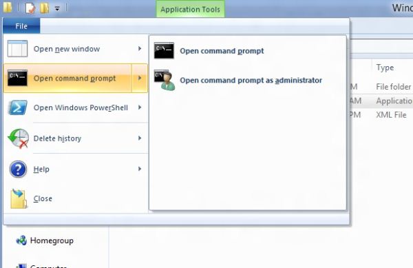
Clicking one of the headings like “File” or “Home” will expose all of the Ribbon functionality temporarily. The File menu is usually always present, and earns its keep solely by the ability to launch Command Prompt and PowerShell windows (both as the logged in user and as Administrator) in the current path, and the Home menu contains most commonly used file tasks (copy, paste, properties, and some others). The View tab controls the view settings, obviously, and the Share tab lets you share files both via email, printing, and burning to disc, as well as handling basic file sharing. To speed up window draw time, folders no longer display small icon overlays when shared or made private—you can view these settings by turning on new “sharing status” columns in Explorer. Hovering over most buttons will reveal tooltips that describe the button’s functionality and, if applicable, a keyboard shortcut that can be used to perform the same action.

A context-sensitive Ribbon menu
Other ribbon menus are context-sensitive, and show up only when applicable files are selected: for example, the Application Tools menu shows up when highlighting an executable, the Picture Tools menu shows up when highlighting an image, the Disk Tools menu appears when working with internal or external drives, and the Disc Image Tools menu shows up when highlighting an ISO or VHD image (both of which can be quickly and seamlessly mounted into Windows Explorer without third-party tools).
Copying Files
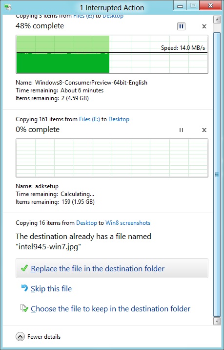
The new file copy dialog box is focused on giving you more information and more options than the file copy dialog in Windows 7. For starters, all file copy operations now happen in one unified window, instead of opening a new window for every file copy. Most file copy conflict resolution also takes place in this window without opening separate dialog boxes, though a separate window does pop up if you need to make choices more complicated than “skip” or “replace.” In the event of conflicts that need user input, Windows queues most error messages and displays them at the end of the operation, so as not to hang up the bulk of the copy waiting for user input.
When two files in a copy operation do conflict, Windows will give you the (opt-in) option to skip files that also have the same timestamp and file size while copying over files that just have the same name as files in the target folder. This catches files with the same name that have actually been changed while skipping over files that have stayed the same.
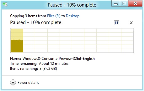
Copy operations can be paused manually, and will automatically pause if the computer hibernates or goes to sleep
In detail view, the progress bar for the copy also serves as a graph of the copy speed over time. Copy operations can be paused mid-stream, and if the computer goes to sleep or hibernates in the middle of a copy operation, the copy will pause and can be manually canceled or restarted the next time the computer wakes up.
SmartScreen
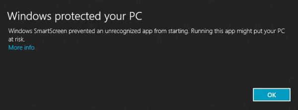
Windows 8 also brings Internet Explorer’s SmartScreen functionality to the OS level—when running an unrecognized or known-bad executable, Windows presents a full-screen message telling you that the program is unrecognized. By default, there’s no button to tell the program to run anyway, preventing an automated “just click Yes” response from users. To run the program, you must first click “More info,” and then click “run anyway.”
Some other, smaller changes have also been made to Explorer: images will now automatically rotate based on EXIF data, a tricky navigation pane scrolling bug has been removed, folders and executables can now be added to the Start screen, and users are no longer prompted to confirm whether they really want to send files to the Recycle Bin. All of these little changes add up to an Explorer update that’s a bit more impressive and a bit more useful than the one we got moving from Vista to 7.
Multi-monitor support
There are plenty of other Desktop features that don’t have anything to do with Explorer, and the most useful of them all is improved multi-monitor support.
In Windows 7 and before, Windows’ multi-monitor implementation supported displaying the taskbar on just one screen, meaning that no matter which screen you were working on you’d always have to go back to the main monitor to manipulate it. No more in Windows 8: the taskbar can now be configured to appear on both screens. This doesn’t change how programs remember their screen location—they still open on the screen they were last launched on, regardless of which taskbar you use to open them. The taskbar can either display all of your pinned icons on both monitors, or you can display all icons on the primary monitor and just icons for open windows on the second monitor. Taskbar location/orientation can be configured independently on both monitors.
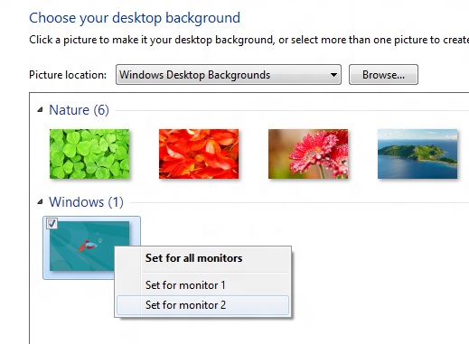
For multi-monitor users, Microsoft provides some extra-wide wallpapers that can stretch across multiple screens, but there’s still no way to use a different wallpaper for each desktop, something that OS X has supported forever. It’s not a big deal, but I’m not sure what technical hurdle it is that Microsoft can’t jump over here. Update: As several readers have pointed out, you can set separate wallpapers for different monitors by right-clicking on the wallpapers in the Personalize control panel and selecting "Set for monitor X" as shown in the screenshot below. Thanks to all who sent this in!
When using a multi-monitor setup, the start screen and Metro apps can only use the primary monitor. You can continue to watch a video or work in desktop apps on the other screen without interrupting what you’re doing in Metro, and vice versa—when not using a desktop app, the desktop and taskbar will sit on the other monitor(s) and wait for your input. Changing your primary monitor can be done in a few different ways—in the Screen Resolution control panel (as in Windows Setup), via the Metro Devices charm, and by right-clicking the taskbar on the secondary monitor and clicking “make this my primary taskbar.”
Notifications

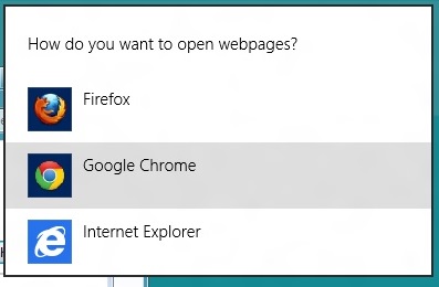
Notifications in Windows 8 eschew desktop windows entirely, even when you’re using the desktop. When an action prompts a notification (common causes include insertion of USB drives or other media and installation of new programs, as well as those generated by installed Metro apps), it slides in from the upper-right corner of the screen. Clicking or tapping it will bring up a menu that lets you decide what you want to do.
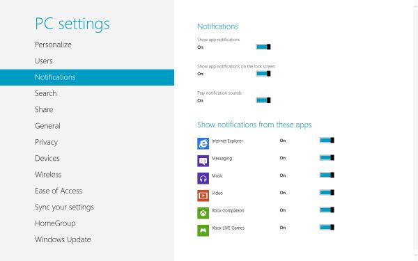
You can control which apps send you notifications in the Settings charm, or in the Metro control panel. Like other mobile OSes, Windows lists all apps capable of sending notifications and lets you toggle them on and off with a slider.
...The More Things Stay the Same
The changes above are the most significant you'll see on the desktop—otherwise, most things have stayed the same. Things like Paint, most Control Panels, WordPad, the Event Viewer, Windows Media Player and countless other built-in Windows tools are more or less identical to their Windows 7 counterparts, often implementing a version bump from 6.1 (Windows 7) to 6.2 (Windows 8) to keep things consistent. Remember: the XP (5.1) to Vista (6.0) transition was the last major under-the-hood version jump for Windows. To maintain compatibility with programs that check the Windows version number, Windows 7 was actually Windows 6.1, and in the same spirit Windows 8 is Windows 6.2.
I don't expect most people to feel very strongly about these non-changes, but there is one that will make a small but vocal subsection of the Windows user base pretty upset: Windows Media Center is still here, and it’s... exactly the same as the Windows 7 version. I suppose that’s good news, if you’re married to Media Center or if you were worried that it would be removed, but if you’re expecting the program to continue to evolve and improve as time goes on, well, it might be time to start looking into alternatives.




286 Comments
View All Comments
phexac - Friday, March 9, 2012 - link
I most definitely plan on skipping Win8, even though I upgraded to Vista and Win7 the day they came out.To know how bad this new disjointed Metro-Desktop environment will be, all you have to do is look at the POSITIVE feedback Win8 is receiving. Apparently, the best that can be said about Metro is that you can be fine with it and it will not create significant problems for that you cannot get around. Where is the feedback of all the great new improvements Metro will bring to your Windows experience? There is none. The best possible scenario for Metro is that, with some practice and adjustment, it will not completely fuck up your computing experience. No thanks. I will opt to stay in full desktop environment that does not force me to deal with a screen filled with ugly tiles that lead to gimped mail and other apps designed for a phone. When I am on a desktop, I want to use a desktop interface and those things called "applications." Hint--they are like apps, except with more functionality to take advantage of greater flexibility of the PC.
Metro seems to be a product of semi-competent management under pressure to do SOMETHING, ANYTHING at all to justify its job in the face of competition that is putting out meaningful well-received innovation. This situation is all too common at Microsoft it seems.
I foresee Win8 being an even bigger flop than Vista. The fact that Metro interface failed miserably in the phone market (devices it's supposed to be best on) is a pretty good indicator that it fucking blows and has no traction with consumers. The logical conclusion from that is certainly not trying to pawn it off on your desktop users.
I hope this product leads to MS losing a shitton of money so that they hopefully learn to listen to feedback of their customer base. Do you guys remember the extensive consumer input and feedback that MS used to design Windows 7? That led to a great product. None of that seems to be happening with Win8, where MS is back to its internal ideas. We all know how good that tends to work for them as of late.
I can see the commercials now: "Hi, I'm a Mac, and I have a User Interface that is not fucking retarded."
PopinFRESH007 - Sunday, April 15, 2012 - link
I love this analysis. You are truly inspired. :)antef - Friday, March 9, 2012 - link
Did I read this right? If you use File History you can't also create system images using Windows Backup? So in Windows 7 they give me an awesome, easy, built-in system imaging tool, but crap file backup so I have to find my own utilities for that, then in Win 8 they give me awesome file backup but take away system imaging? Why in the world could that not be integrated with the new feature?Andrew.a.cunningham - Saturday, March 10, 2012 - link
You can still make images and backups with the "Windows 7 File Transfer" control panel, which is identical to the Windows Backup tool. You just can't schedule both W7 File Transfer backups AND File History backups.antef - Saturday, March 10, 2012 - link
Thanks for the reply (didn't expect one this many pages deep!). That is still a shame, I like my weekly scheduled system image backups so that if something goes wrong with the system it's easy to get back to how things were. And I would be very interested in keeping File History enabled too. It seems like an unnecessary limitation and keeps it from still being competitive with Time Machine. Let's say I do enable the system image backups. Can I still get to Win7-like "previous versions" of files at all, or would that all be shut off?Malih - Saturday, March 10, 2012 - link
I don't understand why some people don't like or even hate the Metro interface. It's a beautiful, and depends on how you're using it, can be your source of quick info (with the widgets and all that) without having to open many apps at the same time.I do think it would work better on desktop or laptop if there's a device like the Magic Trackpad for PC.
I like Metro, and even contemplated on buying the Nokia Lumia 800, if only its price (the Int'l version) is a bit lower.
SunLord - Saturday, March 10, 2012 - link
It's not that hard to understand metro sucks with a mouse on my desktop and is rather disjointed but It's actually not that bad with a touch pad on my laptop where you can do swipes and other gestures so it's probably pretty sweet with a tablet/slate or a all-in-one with a touchscreen that takes advantage of the touch based interface that metro is.B3an - Saturday, March 10, 2012 - link
Complete BS.Metro is faster and more configurable than the Start menu ever was, as this article also points out. Getting stuff done on Win 8 is faster than it ever was in 7. People need to stop trying to use Win 8 like 7 and use it for how it's intended. It's an improvement. Not that people like you will ever give it a chance. Too scared of change. Go back to DOS.
TEAMSWITCHER - Saturday, March 10, 2012 - link
You're wrong. The first time I did a search for "Settings" in Metro I was presented with a ugly grid of small icons and text. Many of the icons were duplicates and some I swear haven't changed since Windows XP. I thought to myself - "Wow, Metro just vomited on my 27" display."If you honestly think that Metro is going to compete visually against the iPad you must be partially blind. Just take a look at the blocky green slider buttons in Metro and compare them to the awesome round and shaded slider buttons of iOS. Metro looks like crap!
Stop saying good things about it - it's the worst OS Microsoft ever created!
stephenbrooks - Saturday, March 10, 2012 - link
1. It would be nice if there was a special "maximise" button that turned a window from your desktop into a Metro "app" that showed up on the list of running apps. What I like about Metro is that Microsoft are embracing the fact that some things are better fullscreen, so there's a selection between screens and then overlapped windows on a desktop within one of those.2. It would also be nice if they had skinned the desktop to look Metro-ish, instead of the utterly different look and feel of the two at the moment. Just needs everything to have square non-bevelled borders + black background really and use solid shading rather than gradients or fancy stuff.
The big reason why I think #1 isn't happening, and the problem with Metro generally, is that it only works with apps written against Microsoft's very specific Metro system. I don't know if they intend to keep this dichotomy forever. They can't migrate entirely to Metro because then developers would have to put all their half-made and experimental programs through the microsoft app approval system! Plus there are things that don't lend themselves to going in the Windows Store, like programs written internally in a company, various sorts of scripts, bespoke simulations used in R&D, etc.
In fact all the *clever* stuff people do with PCs doesn't work in the consumerised app store/tablet model as it stands.