Three Months with Microsoft's Office 365
by Vivek Gowri on January 31, 2013 11:59 PM EST- Posted in
- Microsoft
- Cloud Computing
- Office 2013
- SkyDrive
Generally, Office 2013 works pretty similar to Office 2010, with an interface heavily reliant on the ribbons. Now, I’ve always been a fan of the ribbons, which I thought were a good idea in Office 2007 but really came into their own with Office 2010. It’s been six years since they debuted, so anyone that is still complaining about Ribbon UI should really get over it, especially now that Windows Explorer uses it as well.
The aesthetic has been updated to match the Metro visual style that forms the basis of the Windows 8 and Windows Phone 8 UIs. This visual style has left me a bit cold in Windows 8 Desktop - I like the UI chrome in Windows 7, I feel it gives the interface some three-dimensionality and offers more natural interactions. But in Office, the chromeless aesthetic is awesome. I think it works really, really well in Word and PowerPoint especially, where the starkness and simplicity of the UI (particularly in the hidden command or hidden Ribbon modes) gives you a very blank slate to work from. It’s clean and pure in a very fundamental sense, with no visual distractions at all in the UI.
I’ll also note that the refreshed interface has little to no effect on Excel, which has looked and felt exactly the same since I first used it in Office 97 as a five year old. It’s like the Porsche 911 - no matter what changes under the hood, externally it has looked the same for decades it seems like. Not that it’s a bad thing, since I love the 911 and love-hate Excel, but it’s worth mentioning nonetheless.
Generally, it seems like the Office 2013 has a much stronger focus on the visual style of the content being created than I’ve noticed in previous editions of Office. There’s much more aesthetic polish, with rich templates that aren’t worthless like they have been in many previous editions of Office, nicely styled titles and headers, and many more document design capabilities. Until you use it, it’s really difficult to overstate how much cleaner documents that come out of Office 2013 look. It’s now much easier to create content that are visually pleasing - documents and presentations that just look good and are easy to read without needing to spend a ton of time on formatting.
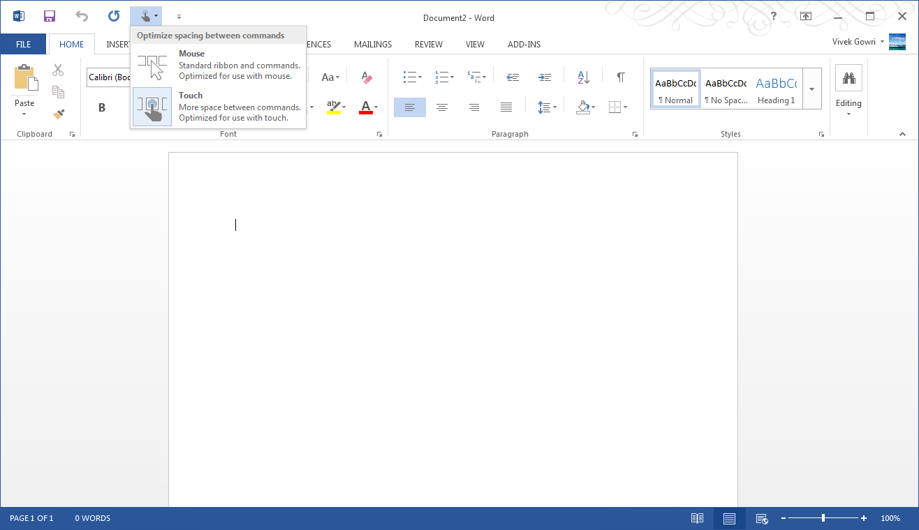
Microsoft is including two input modes: mouse (Office as we know and love it) and touch, which expands the size and spacing between menu options for a more finger-friendly interface without dumbing it down. Look closely at the below screenshot versus the one at the top of the page to get an idea of what I'm talking about. It’s decent to use, but obviously, creating content using the touchscreen keyboard is an outright pain, so this is more for navigation, minor editing, and formatting changes. You will obviously get more out of any office suite with a traditional keyboard and mouse setup, but the new Office at least has a more touch-centric UI as an option.


113 Comments
View All Comments
Tams80 - Friday, February 8, 2013 - link
I agree. White space is badly used. There is a lack of contrast and worst it's painful on the eyes (even using 'dark' modes), which is certainly not helped by the CAPITALS. The menu uses too much screen estate. Then the whole look and feel just feels 'off' to me.Freakie - Friday, February 1, 2013 - link
I really dig the new student subscription to Office. It does suck that it only lasts a max of 8 years, but picking up new .edu email addresses aren't the most difficult thing in the world... Though were 365 really shines is if your university/business has an Enterprise subscription with Lync. Our university did just that and rolled out Lync to everyone last week and it is POWERFUL. It radically changes how us students can collaborate with each other and our professors and really integrates well with a bunch of devices making it really versatile. It's a huge upgrade for us xP And any university in my opinion.VivekGowri - Friday, February 1, 2013 - link
Yeah, our university gave everyone Professional Plus with Lync. I dunno how it's going to play out (or even if that many people will upgrade) but it could end up being really awesome in the future.Freakie - Friday, February 1, 2013 - link
So far it seems that most on our campus have positive feelings about it. We also switched our webmail over to Office 365 so that was even bigger than adding in Lync, and that's were most of the complaints are coming from. But our University, UC Merced, is less than 10 years old and with all the technology teething pains that have gone on since the school's start, it's not as hard to get people to switch or start using a new system because we're all used to it by now. Plus it's a pretty small campus, so IT's evangelist efforts to get people using Lync don't fall on deaf ears and they don't have nearly as much trouble reaching everyone as larger universities do.steven75 - Sunday, February 3, 2013 - link
How is it better than other universities that have been using gmail (via Google Apps) with that built in for years now?CeriseCogburn - Friday, February 1, 2013 - link
iCloud looks like iFool on some levels.beginner99 - Friday, February 1, 2013 - link
I paid less than that price for a bundle with 3 licenses of Office 2010 containing the exact same applications. Just double check and on the shop I use you can actually see it right next to each other, office 2010 with 3 licenses and office 2013 with 1 for exactly the same price. (and I paid less over a year ago for that bundle with 3 licenses than it costs now).So basically MS managed to increase the price by 300%....and people don't even mention it in reviews? Even worse:
" It’s great. If you’ve got 4 or 5 computers to install Office on, $99/year isn’t bad at all"
With Office 2010 I could get 6 licenses for about double that price. But then I can use them as long as I want not just 1 year. Yes, my bundle is missing Access but then most home users don't need that anyway and also most home users keep an office version for years, I would say 5-10 years is not uncommon.
Sorry no. They managed to increases price massively and reviewers applaud for it??? Well, will probably switch to libre-office once my 2010 is outdated.
A5 - Friday, February 1, 2013 - link
Um, your prices are way below what nearly all non-academic users paid. You sure you weren't buying the RZR1911 edition?beginner99 - Friday, February 1, 2013 - link
No idea what you mean b yRZR1911 but here a link:http://www.newegg.com/Product/Product.aspx?Item=N8...
That's $139 for 3 PCs.
Arbie - Friday, February 1, 2013 - link
Thanks for the link. And A5 owes you an apology.