The Corsair Gaming Keyboards and Mice Range: An Experiential Test
by E. Fylladitakis on May 14, 2015 10:00 AM EST- Posted in
- Mechanical Keyboards
- Peripherals
- Gaming
- Corsair
- Mice

Several months ago, we had a thorough review of the Corsair Gaming K70 RGB mechanical keyboard. It was perhaps the most anticipated keyboard in history, amassing feverish hype months prior to its release on gaming forums. The release of the keyboard also marked the creation of a subsidiary company which would focus solely on gaming peripherals. The new division was baptized "Corsair Gaming", brought in its own marketing logo and focuses on the development of high performance gaming peripherals. In that sense, Corsair has never seemed to be a company that feared expansion and diversification. They initially started as a memory products manufacturer after all, infiltrating market after market, paving the way to the very broad products lineup and global presence that the company has today. The creation of a completely new division just for the peripherals could depict a demonstration of how much faith Corsair has that they can become a major global player in that segment of the market.
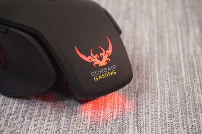
The K70 RGB also was perhaps the only keyboard in existence to collect so many negative comments about the newly found subsidiary company logo. So wrathful were Corsair's supporters regarding the new logo that even petitions pleading the company to maintain the old logo were created. That aside, the K70 RGB for the most part lived up to its hype, which was a serious accomplishment to begin with.
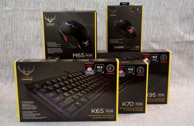
Today, we briefly examine the rest of the Corsair Gaming RGB series: the K65 RGB tenkeyless mechanical keyboard, the K95 RGB mechanical keyboard, the M65 RGB laser gaming mouse and the Sabre gaming mouse. Although they look very similar to the K70 RGB, there are notable differences between the keyboards that this article seeks to identify. The M65 RGB is a high performance gaming mouse designed with FPS gaming in mind, and the Sabre was first introduced shortly after Corsair Gaming was founded, ditching the "FPS-specific" design of the M65 RGB for a universal approach.


56 Comments
View All Comments
extide - Thursday, May 14, 2015 - link
UGH! Those macro keys look like a total afterthought, just slapped on there. Totally un-accaeptable for a keyboard at this pricerange! Oh well, I wouldn't be buying that one anyways, I'd go for the K70.piiman - Saturday, May 16, 2015 - link
"Totally un-accaeptable for a keyboard at this pricerange! "LOL How so? they are the same as almost every other KB with macro keys. They've done them that way for years on their older versions so they are not an after thought but a PROVEN design that is very popular EVEN IN THIS PRICE RANGE!!!! Who made you the feng shui of macro keys?
Wwhat - Wednesday, May 20, 2015 - link
From the article:"The only dissonance is that the extra area for the macro keys is plastic, not aluminum, and the difference is easily discernible by naked eyes. For these extra keys, Corsair expanded the plastic bottom part of the body, trying to simulate the appearance of the brushed aluminum. With the difference being obvious and considering the immense price tag of the keyboard, we expect that many will not be very happy about this."
Wwhat - Wednesday, May 20, 2015 - link
They should have made it a function by allowing the macro key block to be moved to the other side for lefties.Gunbuster - Thursday, May 14, 2015 - link
Sorry Corsair, I used to split my purchases up between you and Razer. As you are sticking strong to the lobster/heart tramp stamp logo I'll be 100% Razer.Notmyusualid - Thursday, May 14, 2015 - link
Don't forget you'll have to register seven credit cards to be able to use or update your Razer product.:)
Tunnah - Thursday, May 14, 2015 - link
You won't be a product because you don't like their..logo ?Hands down, stupidest reason ever
hughlle - Thursday, May 14, 2015 - link
Probably buying it to show off to his mates, not because he needs any of the functionality.Gunbuster - Thursday, May 14, 2015 - link
If two products are nearly equal in functionality and one has a trashy juvenile logo it's not getting bought. They might as well use a penis for the logo after abandoning their classic corporate identity for this bro/mates gamerz junk.angerZen - Thursday, May 14, 2015 - link
Because Razer's three-penis logo is so much better.