The Samsung Galaxy Note5 and Galaxy S6 edge+ Review
by Joshua Ho on October 2, 2015 8:00 AM ESTSoftware: TouchWiz UX and Edge UX
In the case of Android, one of the perennial debates has always been the role of the OEM in regards to software experience. There are some that advocate for OEMs to do the bare minimum, only providing the necessary drivers and other bring-up work to enable a Google/AOSP experience similar to what we see on Nexus devices. On the other end of the spectrum, there are some in the industry that advocate for the use of Android as a base, with significant work on the part of the OEM to introduce their own unique user experiences like MIUI. There’s a ton of room here for personal preference, so it’s necessary to try a UI before deciding that you’re going to be okay with using it for at least the next two years.

In the interest of full disclosure, I’m not particularly enamored by “pure” AOSP experiences. In general, I find that AOSP is lacking in a lot of ways when it comes to out of the box experience. There are quick settings, but there’s no way to add or remove toggles. There isn’t a particularly good weather clock widget for the homescreen, and the Google Camera application is light on features to say the least. Basic features like a battery percentage display in the status bar are also missing. While there are people that want to run custom ROMs to personalize all of these things, for most people I think some additions are helpful.
In the case of the Galaxy Note5, we’re looking at something that tends a bit closer to a full conversion UI like MIUI. Samsung’s TouchWiz has often received a great deal of criticism, but for better or worse with the Galaxy S5 and S6 Samsung has been toning things down to be closer to Android in terms of overall design and less emphasis on the longest feature list possible. For the Note and Edge lines, Samsung continues to add new features designed to enhance the usability of the stylus and edge display, respectively.

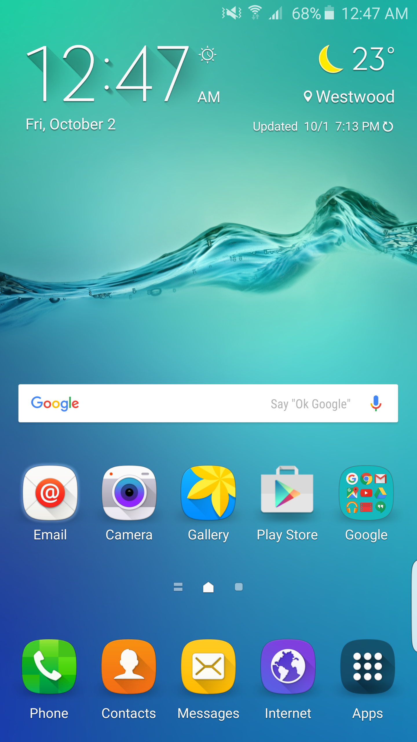
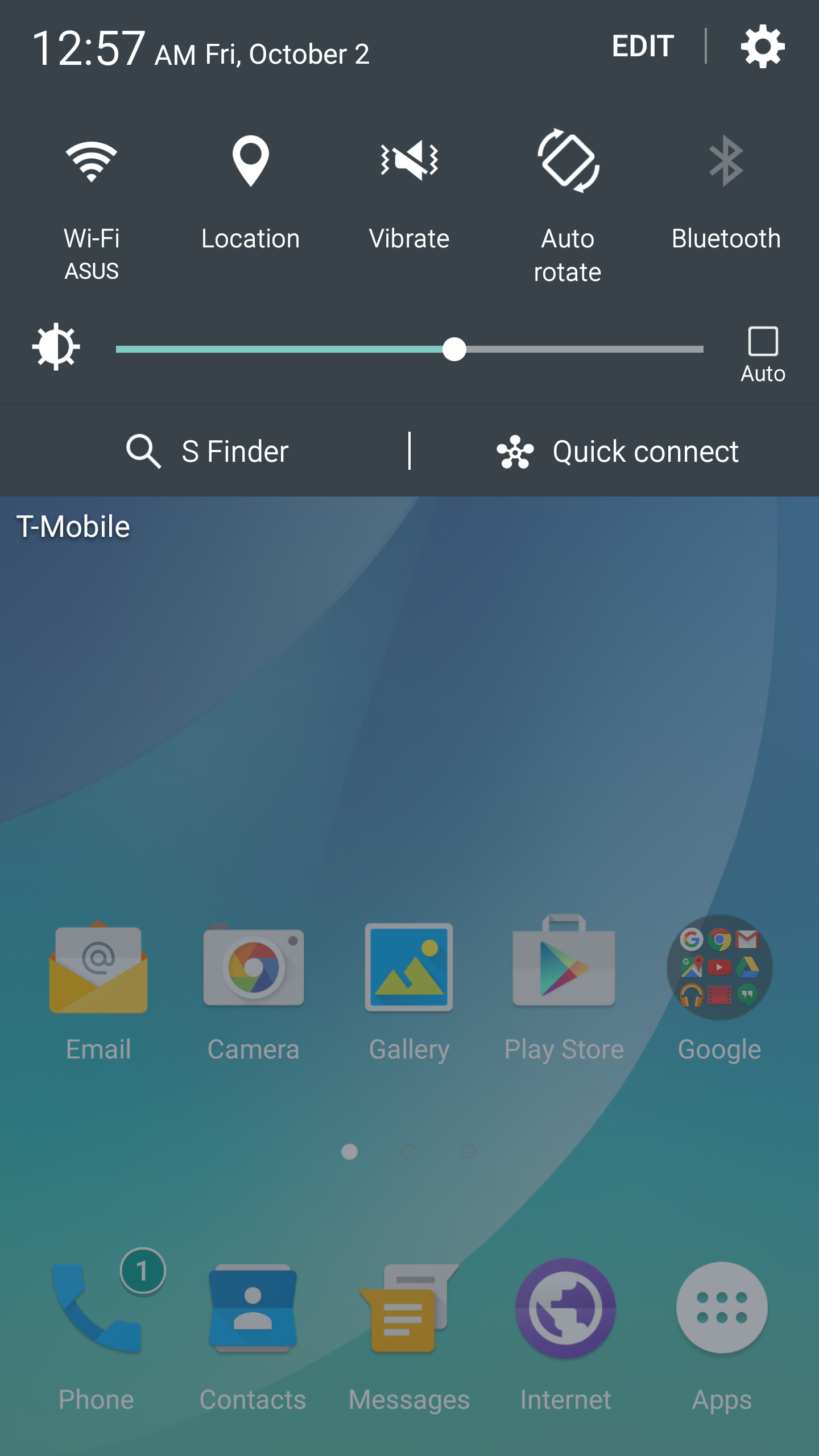
Other than these features, the Galaxy Note5 and Galaxy S6 edge+ have effectively the same UI as what we saw with the Galaxy S6, so those interested in a deeper look at the changes in TouchWiz for everyday use should take a look at the Galaxy S6 review to learn more. For the Galaxy Note5 and Galaxy S6 edge+, the only major changes from the Galaxy S6 are mostly in the form of a new set of icons. In practice, this isn’t really a change if you use a custom theme to try and clean up the aesthetic like any of the material design themes. The vast majority of the differences are centered on the new stylus functions and edge display functions, respectively.

In the case of the stylus functions, the Galaxy Note5 is a definite step up from the Galaxy Note 4. Samsung continues to be one of the few OEMs in the mobile sector to actually take styluses seriously, and it shows with the Note5. There is the problem of damaging the phone if you insert the stylus backwards, but the actual functionality that the stylus provides is excellent.
Although not really a part of the software, the pen itself is well designed so that the tip of the stylus has enough friction so handwriting feels natural. The latency isn’t quite at the level of pencil and paper, but lines track quite closely compared to older models like the Galaxy Note 3 or 4. Even at extreme angles the stylus tracks accurately and inking occurs exactly at the tip of the stylus where it touches the display rather than where the point of the stylus nub is. The pressure sensitivity curve is definitely fine-grained, but I feel like where the lightest possible pressure starts and where the heaviest pressure ends isn’t quite right. If I lightly graze the screen with the stylus, inking doesn’t really work unless I put some downward force to compress the tip. At the high end, it feels a bit like the force needed might be a bit excessive as any normal pencil would have a broken lead if I applied as much pressure as I did with the S-Pen to get to the highest pressure level.
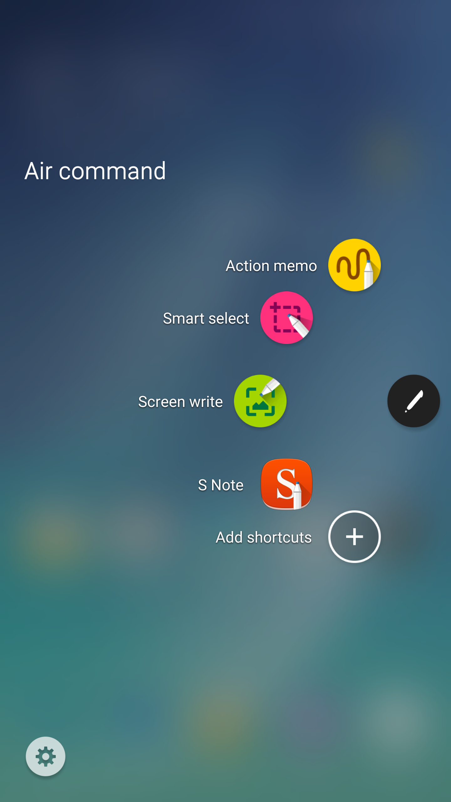
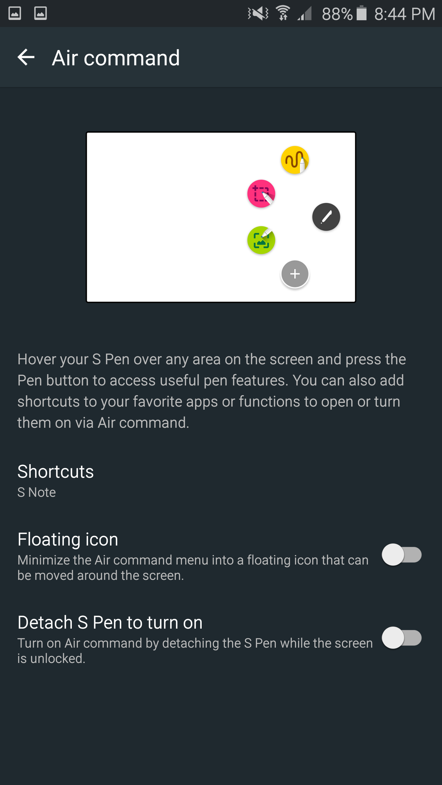
The software aspect of the Note5 is also very well executed for the stylus functionality. When you first take out the stylus with the display on, there’s nothing that immediately launches on the display which helps to reduce clutter. The Air Command display only opens up if you press the side button the stylus, which opens up Air Command. By default, you get shortcuts to pretty much anything you’ll ever use with the stylus, but there’s an option to add more shortcuts if you install extra applications that take advantage of the S-Pen. If you close the menu the Air Command button will remain in a translucent icon overlaid on the display, but it doesn’t react to any touches unless you use the S-Pen and can be removed by long-pressing the button with the S-Pen and dragging it to the top edge of the display. I personally ended up turning this feature off though, as I found it easier to just always press the side button to open up the stylus shortcut menu.

With the Note5, the default applications that support the S-Pen remain. You get Action Memo, S-Note, Smart Select, and Screen Write. Action Memo and S-Note are similar, but Action Memo is more of a quick notepad rather than the full-featured notebook application that is S-Note. Screen Write allows you to directly annotate a screenshot with the stylus, and Smart Select allows you to only screenshot a part of the display that is selected with the stylus.


These apps aren’t new, but they come with new features. For example, the Note5 adds the ability to use Action Memo with the screen off is and it’s quite helpful for writing things down in the moment. Scroll capture is a part of the Screen Write functionality and is similarly useful, but I continue to question why Scroll Capture is embedded into this application instead of being integrated into the native screenshot function.
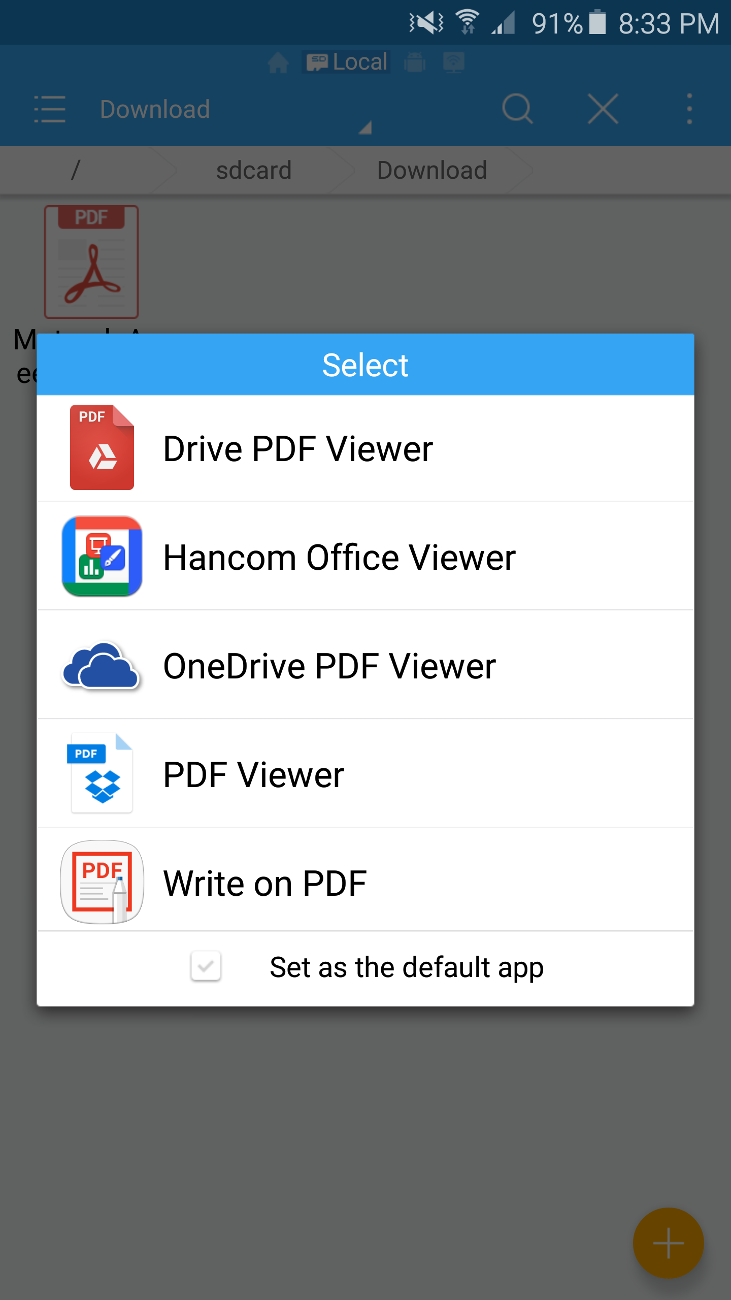
The final new feature for the stylus is PDF annotation, which is actually quite useful if you’re doing something like signing a contract in PDF form when the agreement requires a signature. More than once, I’ve had to actually print out the document and sign my name, then scan the document before sending the completed document back which is a pretty absurd waste of paper and ink.
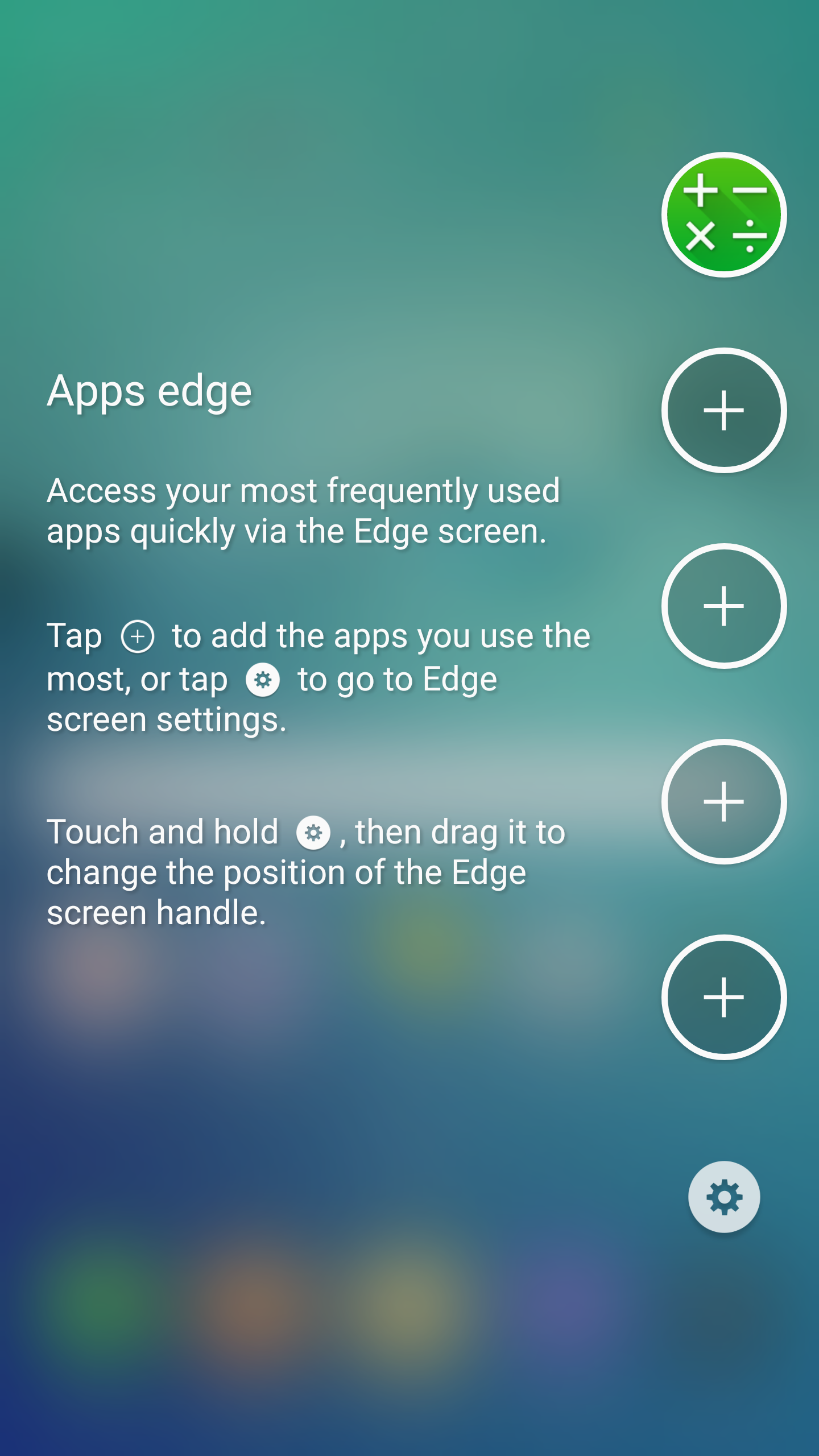
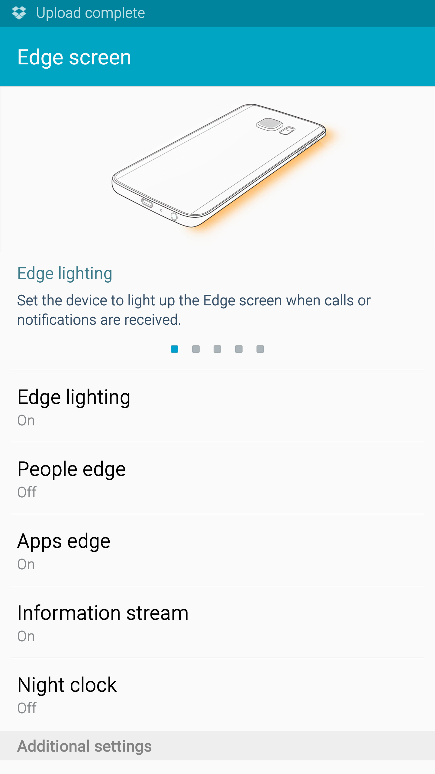
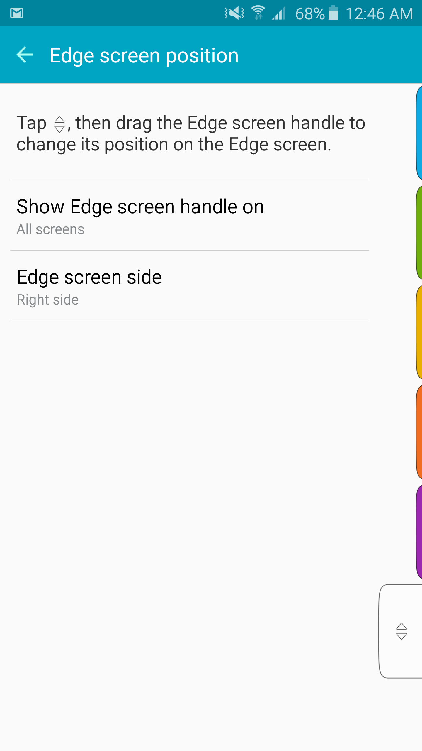
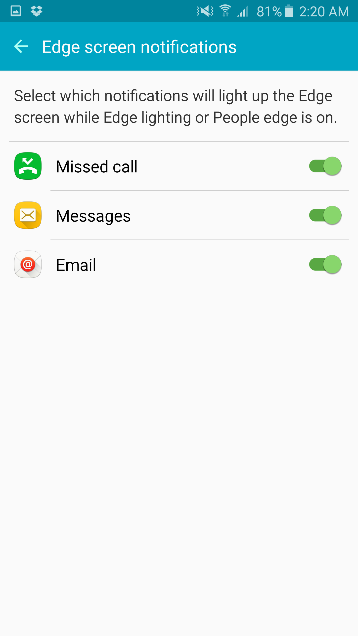
The Galaxy S6 edge+ has none of these features, dropping the stylus in favor of the edge display. In practice, there are a few applications that exist for this display. When the display is off and the phone is flipped over, the edge will light up when calls or notifications come in. If a call is coming in and the phone is in this state, you can reject the call by holding your finger over the heart rate monitor. The color can also be set to change depending upon whether a call or text message is coming from a specific contact. The edge display can also be used as a night clock, showing the time and date along the edge of the display. It’s also possible to view some quick information along the edge of the display by swiping along the edge of the display to view some news headlines, the time, date, and weather. The final feature of the edge display is that you can swipe in on the edge of the display to open an app drawer or a quick contacts drawer.
For the most part, all of these features are forgettable. There just wasn’t any good reason to use any of these features. The edge display is a cool piece of technology, but the practical applications are almost nonexistent at this point in time compared to the stylus, which has very obvious and clearly valuable use cases by comparison. I’m trying to keep an open mind about this, but I strongly feel that the edge display is solely an aesthetic change rather than a functional one. The odd touchscreen behavior around the edge makes edge swipes difficult as well, which is also a poor user experience in my experience as Android heavily relies on edge swipes throughout applications.
Overall, TouchWiz continues to be a decent Android skin, but at its core isn’t necessarily a selling point for Samsung phones. In the past we saw that TouchWiz was amazingly performant, but in my experience the Note5 and Galaxy S6 lack a certain level of smoothness. I don’t know how to really quantify this, but using something like a Nexus 5 and comparing it to the Note5 back to back the Nexus 5 has a tendency to feel quicker and smoother for whatever reason. The stylus features of the Note5 are a selling point though, to the extent that it could make the Note5 the only option if you absolutely need a phablet with a stylus. The edge features are unfortunately not nearly as compelling, and the experience is pretty much identical to the Galaxy S6.


225 Comments
View All Comments
lopri - Friday, October 2, 2015 - link
Also odd that the author thinks the color shift on the Edge+ is due to RGBG subpixel layout. I thought the color shift would be there due to curves regardless of subpixel layout.In any case I give the author props for this effort. A rather thorough review, even if a little heavy on editorials.
lilmoe - Friday, October 2, 2015 - link
After being called out so many times, your "comparison charts" are still an absolute (intentional?) mess. Why do you have 25 different phones on one chart, and 10 completely different ones on others? Why is the crappiest browser on Android still being used for battery tests? Why is the iPhone 6 in GPU tests and the 6plus absent?While they do have really nice articles, Anandtech scores the lowest in the consistency department out of all sites. Please try being more consistent.
Can you just put 4-5 most popular phones of each platform on the SAME darn charts and keep them that way, without conveniently leaving some out and putting them back here and there? Like PLEASE?
Also, it would be nice if you'd explain why you're posting NAND performance benchmarks with your particular set of settings. I seriously find it VERY hard to believe that UFS 2.0 is equal or often slower than the very best of eMMC in sequentials and randoms.
lopri - Friday, October 2, 2015 - link
The real mess is the camera samples. (which by the way is not limited to Android devices for a change) It is maddening to sift through camera samples without knowing ahead what I am going to see only to click dozen more times to find out what I am looking for.Kuzi - Saturday, October 3, 2015 - link
Agreed their charts are a mess.Bob Todd - Friday, October 2, 2015 - link
The gigantor phone market is more competitive than ever, so it's interesting to see them dropping features and generally not taking full advantage of being the most vertically integrated Android OEM. They dropped microSD but capacity maxes out at 64GB. They had the opportunity to be ballsy and go higher capacity PCIe NVMe and absolutely crush every other Android OEM in storage performance. You have to *really* want the pen, because this looks like a tough sell at $780 for 64GB when $650 gets you a 128GB Nexus 6P and $500 gets you a 64GB Moto X Pure with expandable storage. Sure Samsung's SOC is better, but this is a pretty underwhelming release for me.TheinsanegamerN - Friday, October 2, 2015 - link
Not to mention the sealed, non removable battery. And samsung's terrible track record with updates.thedons1983 - Sunday, October 18, 2015 - link
Sealed, non removable battery = better looking device. Simple as. Never mind the fact, that most users do not want to swap the battery, as they simply don't need to. How obsessed with your phone are you anyway? You should probably try getting a life instead!!lilmoe - Friday, October 2, 2015 - link
Samsung knows a thing or two about fast storage, and their UFS 2.0 is pretty darn GOOD. It's just not showing well on you-know-who's charts.Bob Todd - Friday, October 2, 2015 - link
You are missing the point. They are charging more than "good enough" money for this thing. They need to offer compelling reasons to spend way more on this than the other solid new entries in this segment. Something like a PCIe NVMe solution would have been a good way to justify that price gap. I predict steep discounts (~$100+) shortly after launch.lilmoe - Friday, October 2, 2015 - link
"I predict steep discounts (~$100+) shortly after launch"They already priced the Note 5 cheaper than the Note 4 at launch. Sorry if American carriers are over charging.
"You are missing the point"
Read my *short* comment again. Their storage solution isn't particularly inferior. Random reads and writes are comparable, if not better. If you honestly believe that sequential performance is more important than random for everyday workloads, then I have nothing else to tell you. It's not like we have an extensive comparison of performance and power consumption/efficiency between Samsung's UFS 2.0 vs Apple's sourced NVMe solution (might not even be possible at this stage), nor is it the case that Samsung has already developed a miniature PCIe V-NAND 950 PRO NVMe SSD and is holding back to "cut corners".
Everything in this segment is overpriced, for better or worse. We just learn to "deal with it". That said, your point boils down to overall manufacturer costs, ie: BoM. You shouldn't make assumptions on your own over bits and pieces of the package. Samsung, despite manufacturing most of their parts, have a costlier BoM than most other OEMs, including Apple. Their external enclosure, AMOLED screens, Wacom Digitizers, DACs, etc. are always best in class and cost more than comparable parts from the competition. Other than the omission of SD-card controller, they went all out in every other detail (removable batteries don't contribute to cost, it's a design choice rather).
That said, I'd rather have them start with 64GB of standard storage (128GB option) and an SD-Card slot for a much more value proposition at that price range. A larger ~4000mah battery would have also been possible since the Note 5 is relatively large but is one of the lightest "phablet" out there. This goes for all manufacturers, not only Samsung.